Thursday, 28 May 2020

Reflective Writing


Description:
The semester is coming to an end. In this semester, I have learned about the process of the art design and the application of electronic technology in this process.

Feeling:
I complete my characters by making plans and researching other works to inspire myself.

Evaluation:
I think it was okay, although it wasn't great.

Analysis:

I'm a procrastinator, always rushing to finish my homework at the last minute.


Conclusion:
Because I did it at the last minute, it didn't work out very well.

Action Plan:
I need to stick to my plan so I won't always be in a hurry.

Wednesday, 27 May 2020

Feedback & UX Testing


Mobile Devices
Before I get into the feedback of testing the site, let me briefly talk about the editing of my site on mobile devices.

On WIX, the site should be able to be edited in both desktop and mobile mode before making sure that no matter what device the viewer USES to view my site, there is no problem.

After the desktop website editing was completed, when I went to the mobile device mode to edit, I found that the images and text I set were not missing, but the position had been shifted.
desktop

Mobile Devices

Mobile Devices

Feedback & UX Testing

UX testing is an important part of the site's formal launch, and it can help you spot a lot of problems that you might have missed.

After I finished the site, I created a Google form and linked it to my site. By inviting people to see my site, fill out this form to review my site and modify it in a timely manner.

My google form address:
https://forms.gle/UgsAEqHjVV6XmXwt7

My new website:
https://h1925492660.wixsite.com/rsarchitrct

So far I have received a total of 4 feedbacks.

Feedback:
1. home page
When I checked later, I found that a project picture was not linked to the project page

2.contact
I added a contact form with only two lines: one for the visitor to fill in the email address, and the other for sending.

3.projects page
 I have changed and added pictures later.

4.my story
 I added something about my work this semester.

5.feeling
I added an explanation of the background photo to my previous blog.

 6.device
 This shows that my site has been tested on all devices.

7. other opinions

I double-check some of my website links, spelling and grammar.
I have modified the community centre project.

Monday, 25 May 2020

Page Three: PROJECTS


Process

1. The title of the page: PROJECTS

2. The template:
the main page of all projects
the paging surface of a project

3. Collecting the picture of projects

I found that those projects I did in this term are from two courses, Digital design and 2D&3D design, so I decided that the page of projects is divided into two main categories.

Then, the title at the top of the page is changed to 'HOME', 'MY STORY', 'DIGITAL DESIGN', '2D&3D DESIGN' and 'CONTACT'.

Next, I collected my projects.
screenshot of DIGITAL DESIGN

screenshot of 2D&3D DESIGN
4. Modifying those project photos
I modified those photos in PS. For example, modifying the moon cake box size diagram.
  PS operation screenshot of modifying the moon cake box size diagram
5. Making the main page of all projects

Firstly, I adjusted the template according to the number of all projects.
Then, I chose the best picture for every project.
Next, I added them to the main page of all projects.
Then, I chose the background of this page according to the photos. For example, on the main page of DIGITAL DESIGN, the colour of the background is similar to two pictures, and the whole background colour is hazy to highlight the project photo.

screenshot of DIGITAL DESIGN
6. Making the paging surface of every project
Firstly, I added the images to the website according to the template.
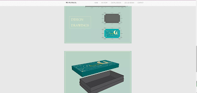
Next, I thought of the text to describe my projects. For example, in the project of mooncake box, I chose the words from the final board of the project.
screenshot of Mooncake box page
Finally, I added all pictures and words of all projects.

7. Adjusting the images and text throughout the site.

8. Checking these page.


Background

I'm going to mention some background here that I didn't mention before.

1)Community Centre
I made a picture of fair-faced concrete as the background picture of this project, because the main material of this project is fair-faced concrete. The image was made from a cut from a wall of fair-faced concrete and filled in with paint bucket tools in photoshop.

2)Pen Still Life
This background image is a pen line that I drew myself.

3)Recreating Painting


This is a picture provided by Wix, and I'm hanging it as a background photo for this project because the sky in this picture is blue and yellow like the colour of my painting.

4) Self-portrait
This background painting is a colour lead line drawn by myself, using the same colour as the first picture in this project.

5)Basic Construction

This is painted with wood colour in photoshop with a branching brush, which is very consistent with the colour of this project.

6)3D Sustainable Piece
These four colours are from Mondrian, and the colours of my project are also borrowed from these colours.

Sunday, 17 May 2020

Page One: HOME


1. The title of the page: HOME

2. The template:


It is backed by a clear, high-quality image with the title of the main page at the top and a large website name in the middle. 

3. Changing that information:

  •  The website name is designed as 'RS Architect' because I have RS in my given name.
  • The title of the page about the introduction of the website was changed to my story

4. Changing the background:
I decided to set one of my best project photos as the background
After adding all the projects, I will choose the best picture.

Then, I found that none of my photos could meet the requirements of high definition and high quality, so I used a picture provided by the Wix website itself as the background of my HOME page.

The reason why I chose the picture as my background is the colour. The overall tone of my site was cool but not overcast. After adding my portfolio, I found that some of them were very dark or colourful. So I think I should choose a dark but not depressing picture as my background. The rest of the images provided by Wix are showy, plain, or dark. This is a moving image of a woodland snow scene, dark but full of life.

5. Choosing some projects to show on the HOME page.
After careful comparison, I chose 4 pictures.


6. Linking those images to the project they point to.

7. Checking all information of the HOME page.

Page Four: CONTACT


1. The title of the page: Stay In Touch.

2. The template of the page:
it includes a picture and some information that consists of the name of the website, the address of the office, the telephone number, and social media.

3. Editing my information


R S Architect.
Currently studying at DMUIC
(De Montfort Univesity International Collage)

I choose two social media on my website, Blog and Instagram. 
I chose the black line icon because the whole page is plain and elegant.

effect

4. Changing that picture and background

This picture was taken by me one year ago in a riverside park in Shanghai.
The reason why I chose the picture is that I like it.


5. add a contact form
I added a contact form with only two lines: one for the visitor to fill in the email address, and the other for sending.


Summary


Page Two: MY STORY


1. The aim of the page is to introduce myself.

2. The template of the page:


It consists of a team introduction and a team member introduction. 


Team members are introduced into clear black and white photos and personal contact information.

3. Template adjustment

I only keep my profile picture and a self-introduction, because this website is my personal website.

4.choose profile picture and background


effect

  • Professional Photograph
The requirement for professional portraits is that the characters should be concise and spiritual. I find it hard to find a suitable portrait right away for someone like me who takes a lot of pictures. So I came here thinking if I could photoshop a picture.

I first took a photo of myself looking a little more alive but in a very life-like setting, removed the background and replaced it with a grey one. Finally, I changed it to black and white.

  • background
This is a snow scene I took two years ago. It happened in my hometown, a small city in the south, where it is hard to see the snow. 

The reason why I choose the picture is that the colour is simple but elegant, very suitable for the background of black and white photos.

5. self-introduction

'I'm an architect from China, and I'm studying Art & Design at De Montfort University International College.'
Firstly, how to introduce myself, I just think of these sentences, and then don't know how to go on.
Then, I started to search for profiles on personal websites. For example, in the following case, I found his introduction very interesting.


This is a profile of a web designer who mentions his interests and then USES a video to talk about his work. There are a few words and no difficult sentences to understand.

Next, I thought about how I could use this and modified my template.
I divided the page into two parts. The previous section is my background pictures and other details; the next section is my portrait and brief introduction (that is, my career and current status).
The reason why I changed the template is that this gives people a choice between the brief introduction and the detailed introduction of the latter. And I think a long paragraph is hard to understand.

Then, the aim of making the website is to show me and my projects, so the details of the introduction should my idea, my work, and my hobby.

Finally, the self-introduction:

I have been studying architectural design since university, and I started from the function of architecture to design. After working for 3 years, I hope to go abroad to further learn how to design.
I like to take pictures of various buildings and landscapes daily, to think about why this building is good and where it is not good. In my spare time, I also read history books for entertainment.
I am going to show you all of my work this semester on this website. I learned and practised some courses and assignments about digital design and 2D&3D design. I usually draw a rough idea in a picture book first, and then make it with different tools according to different people, such as laptop, painting paint or some model materials similar to express boxes.


Summary


New project for website & Reflection for all works

1. New project: Waterfront Hotel  I inserted pictures and descriptions according to the template on my website. Based on the logo on my fina...